Converting more website visitors to paying customers is a fine art. And one of the key elements in your digital marketing palette should be optimized landing pages. A well-designed landing page can improve your conversion rate, lower the bounce rate, and make a big difference to your CPA (Cost per Acquisition).
That’s all very well, but how can you stand out and create a truly winning and high-converting landing page?
Let’s start with the basics first.
What is a landing page?
A landing page is a standalone web page that’s designed with a specific goal in mind – to increase the likelihood of a conversion. This could involve actions such as signing up for a newsletter, downloading an e-book, booking a call, or making a purchase, all depending on the objectives of your marketing campaign.
Most often, a landing page is employed as part of a specific digital marketing campaign. It’s especially common for PPC ad campaigns but can also be used to funnel referrals from specific sources, for example, organic links from a partner or traffic from social media posts.
The goal is to make the information on the landing page very specific and focused on what has been promoted with your campaign.
For example, if your ad promotes a course about cybersecurity, the link should lead to a landing page that shares details and purchase options for that course. You don’t want them to land on your home page and spend time navigating through it, trying to find the course they came there for.

What is a high-converting landing page?
In general, high-converting landing pages are considered the ones that generate the desired or higher than expected number of conversions.
Like other marketing tools and platforms, success metrics can vary from one campaign to another. The key metric to evaluate your landing page’s success is the conversion rate. To calculate the conversion rate of your landing page, use the formula:
Conversion Rate = (Conversions / Total Visitors) * 100
Conversion rates can vary significantly based on factors such as the product or service, industry, target audience, or conversion goal. For instance, getting a visitor to download a free e-book is generally easier than persuading them to make a purchase. Consequently, the conversion rate for lead generation through a free e-book download is likely to be higher than that for software purchases, for example.
Here are specific statistics for average conversion rates across different conversion goals:
Lead Generation:
- Downloading a free e-book: 10-15%
- Signing up for a free trial: 5-10%
- Registering for a webinar: 2-5%
E-commerce:
- Adding an item to the cart: 20-30%
- Completing the checkout: 1-2%
- Returning to make a purchase: 5-10%
SaaS:
- Signing up for a free trial: 5-10%
- Upgrading to a paid plan: 2-5%
- Renewing a subscription: 80-90%
So, while there is no one-size-fits-all approach, if your conversion rates meet or exceed your goals, you can consider it a successful landing page.
How do you build a high-converting landing page?
Designing a landing page is similar to creating an ad campaign. You increase your chances of success by leaning on established, tried, and trusted principles or templates. Successfully implementing these can help you avoid the trial-and-error process and get right into converting more leads than you can handle.
Let’s dive into what it looks like by examining the 8 critical parts of high-converting landing pages.
1. A headline that can’t be ignored
A large chunk of your traffic won’t make it past your landing page headline; heat map studies of multiple landing pages confirm this. Every visitor will look at your headline, which is usually the first sentence on your landing page, to verify if they are in the right place. If they aren’t immediately hooked, they will leave and bump up your bounce rate. That also means all your work to create the landing page copy is out the window.
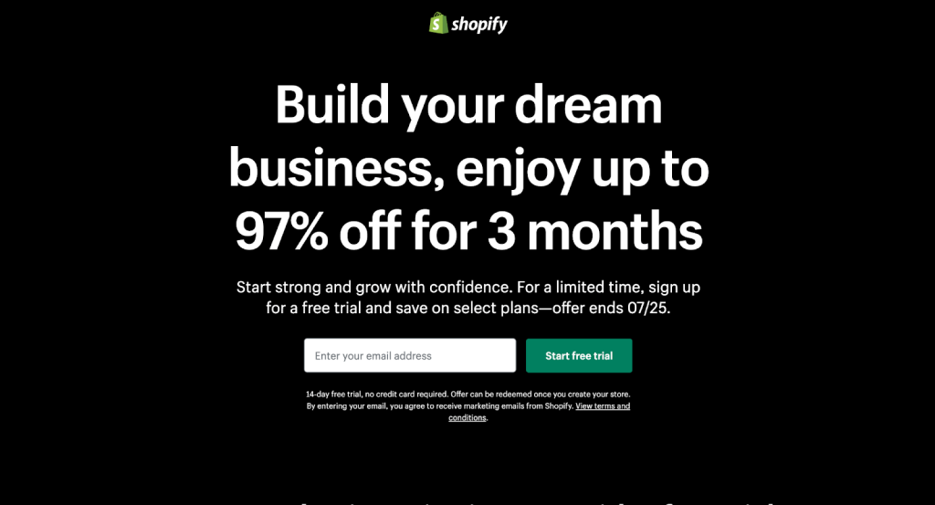
This is a great example of a high-converting landing page from Shopify… They’re selling you YOUR DREAMS! Plus a 97% discount. Surely, it doesn’t get better than that.
Looking at the example above, you can see that when creating landing pages, it’s essential to spend time writing a headline that your leads can’t ignore. You might not be selling them their dream business or a nearly 100% discount. But how can your product speak to their needs and wants?
Check out our guide to power words that inspire action.
The most effective (and simplest) idea for writing a headline is to make a promise that addresses your visitor’s pain point and then deliver that in the copy.
The headline has one job: getting the visitor to read the next line. So, you have to make it that good. How?
- Directly address the pain points that your offer addresses
- Include an overarching benefit of your product
- Use subheadings that let you expand on your headline
- Make the headline stand out in a large bold font
Take a look at our guide to creating copy for PPC ads – which also applies to these high-converting landing pages.
2. Focus on the user benefits, not the features
The next secret to a landing page that converts well is addressing what’s in it for the user. As visitors scan your landing page, they are actively looking for something to make them stop, read, and digest your information. One effective way to do this is to show what’s in it for them instead of just talking about the product.
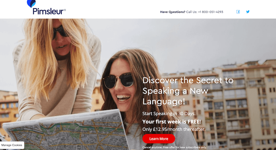
For example, in the example above, the user can ‘discover the secret’ of speaking a new language. (Spoiler alert: it’s repetition and consistency).
Or, instead of talking about how lightweight your software is, talk about how quickly users can load it up and accomplish their tasks. Instead of how swift your shipping is, remind users that they can get their packages in less than x hours.
As the product creator, this may be tough to do initially. You are proud of your product, and it’s important to you that everyone knows just how amazing it is. But the truth is, they won’t pay attention to any of that. They are only concerned about its utility.
How can you keep the focus on the benefits and boost landing page conversions? Here are some questions that can help you present your product benefits instead of the features. Answer these, and you’re one step closer to writing copy that will convert like magic.
- What can the user achieve with this?
- Who will this product benefit the most?
- What problems are users trying to solve with this product?
- What will this specific feature help the user accomplish?
3. Show how helpful your product has been to other users
Many high-converting landing pages let their customers do the selling for them. Marketers have seen their conversion rates double by simply adding user testimonials, and it’s not hard to see why.
People want to know that your product works, and hearing it from just you isn’t enough.
Plus, nothing beats hearing advice from someone who’s walked in your shoes. Testimonials are compelling because they show your leads what to expect after buying your product.
When using social proof, written and video testimonials are two of your biggest options, and they both have merits. Written testimonials provide a thought-out opinion and are easier to read while scrolling. Video testimonials lend more credibility by showing the face behind the review, but your leads will miss them if they don’t stop and press play.
The best testimonials are written in the customer’s words, but it often helps to ask the right questions so that readers can relate to them.
Here are some questions to ask customers when requesting a testimonial:
- What’s the biggest problem you wanted to solve with this product?
- Why did you choose our product/service?
- What was the best part of using this product?
- How was our product/service better than others you tried?
- Would you recommend us and why?
4. Make the content scannable and easy to follow
There are two ways to do this, and they both involve changing your landing page design: Using short sentences and paragraphs and breaking the text into subheadings.
Using short sentences and paragraphs across the entire landing page ensures that leads can read your copy quickly and easily and understand every word. The goal is to communicate as simply and as effectively as possible.
Some copywriters also make sure to write like they talk. This style of writing makes the text read more like a conversation than a web page that’s designed to sell you something.
However, you should pay attention to your brand voice. The language used and how it is presented are major factors in keeping the reader’s attention.
Additionally, consider tailoring the content to match the funnel stage of your audience. For instance, if your landing page is part of a brand awareness campaign, include relevant information that educates the visitor about your brand, product, or service.
Read some tips in this article for bottom of funnel content.
As we mentioned before, most people are just looking to browse until they see something that catches their eye. You want to make that search easier for them by breaking your landing page copy into segments.
Here are some more tips to help you create content that’s easy to follow.
- Keep language simple – avoid using big words
- Use active voice – if you’re not sure what that is, here is a handy guide
- Use engaging and relatable language. Humor and emojis can work well on landing pages
5. Engaging visuals
Visuals are powerful tools for grabbing attention, conveying information, and building trust. When it comes to a landing page design, they play a crucial role in complementing and enhancing the message. Images, infographics, and videos will help you break up large chunks of text, making the page more visually appealing and easier to digest.
The right visuals can easily address the pain points and trigger emotions to create a positive association with your brand. They can showcase your product or service in action, providing the potential customer with a clear understanding of its benefits and features. This is especially important for building trust and encouraging visitors to take the next step.
So make sure you include high-quality product photos and videos, infographics and data visualizations, or video reviews. These elements not only improve the overall user experience and brand experience but also increase the likelihood of visitor conversion.
Tips for using visuals:
- Choose visuals that are relevant to your target audience and brand.
- Use high-quality images and videos.
- Optimize visuals for mobile devices.
- Use alt text to describe images for accessibility.
6. Use call to actions (CTAs) that inspire action
No well-meaning marketer would launch a page without a call to action.
But, how you design the call to action and the specific words you use can make all the difference… And help you crack the high conversion rate formula.
The idea is to build successful landing pages by using calls to action that remind your lead of what’s waiting on the other side. So instead of generic phrases like “download now,” you could use “give me the free ebook.” or “show me how to achieve benefits.”
Multiple studies have confirmed this. In one, marketers tested “add to cart,” “buy now,” and “purchase now” CTAs. The “purchase now” performed 5% better than “buy now” and 14% better than “add to cart.”
It’s also great practice to add CTAs across the entire landing page, not just towards the end. This way, you give your leads multiple opportunities to make the decision and buy.
Finally, studies have found that tweaking your landing page design and adding a bright-colored CTA can boost conversion.
Here are some other CTA ideas:
- I’m in!
- Book my free assessment
- Help me save
- Get the benefit bundle
7. Optimize your forms
No matter how compelling your landing page is, lengthy forms can discourage potential leads from taking the desired action. Short, concise forms and free of non-sense fields can significantly improve conversion rates.
When creating your forms, think about the necessary information you’ll need from your user. If it’s a newsletter signup form, why would you need a user’s place of birth or level of education? Just leave these out, capture their e-mail address and any other information that might be relevant based on your audience segmentation, and let the leads flow.
Here are some tips on how to make your forms short and easy to follow:
- Ask only for the information you need.
- Use clear and concise language.
- Break down long forms into multiple steps.
- Use progress indicators to show users how far they are along.
- Make the form visually appealing and easy to navigate.
- Offer alternative ways to submit information, like social logins.
8. Optimize the page loading speed
Last, but not least, make sure your audience won’t have to wait for your landing page to open after clicking the link.
In a world where the average human attention span is 8.25 seconds, page loading speed is a crucial factor in order to retain the interest of your audience once they land on your page. Some statistics show that the chance of a bounce increases by 32% when a page load time goes from one to three seconds.
So, if you don’t want to lose potential customers once they land on your page, make sure to improve its loading speed.
Some basic tips to follow:
- Minimize the number of HTTP requests.
- Compress images and other media files.
- Use a content delivery network (CDN) to distribute page assets across multiple servers.
- Enable browser caching.
- Choose a fast and reliable hosting provider.
Why optimizing your landing pages is important
1. Value through optimization
Marketers understand the importance of optimization. You do extensive keyword research, test multiple ad campaigns, and even A/B test web pages because you’re trying to push the conversion rate as high as possible.
High-converting landing pages operate by the same logic. By tweaking a few elements – emotional triggers here, irresistible CTAs there – you can slowly raise the conversion rate on your landing page and boost sales.
2. Shorten the entire marketing funnel
The faster your leads convert, the shorter your entire funnel will be. That means you’ll invest less in retargeting ads, rely less on your email newsletter campaigns, and even optimize your ad spend, with an improved cost for each customer acquisition.
Turning your pages to high-converting landing page status by communicating the value of your offer clearly could also allow you to widen the top of your funnel. If you know that a significant number of leads that pass the awareness stage eventually convert, you will drive as many leads as possible.
So, a well-optimized landing page won’t just boost your conversion rate, but it will support your overall customer acquisition strategy (CAS) in the long run.
3. Beat the competition
If your visitors are ready to buy now, your landing page may be the only thing standing between them and your competitors. You need to put your product’s best foot forward and show them there’s no need to keep looking. Also, because you can’t always rely on retargeting ads to bring them back to your website.
But if your landing page doesn’t make a good impression the first time around, potential buyers may write off your brand and choose your competitor. With our attention spans online shorter than ever (8.25 seconds), you only have a few moments to show potential customers that you’ve got the goods.

Landing page examples
If you’re looking for some inspiration from existing landing pages, we’ve pulled together these great campaigns.
Moz
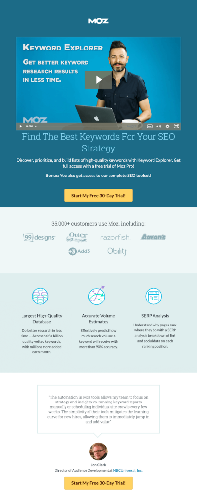
As you’ll see from this simple yet effective landing page from Moz, they have really distilled the key points into a very small area.
Yes, Moz is a well-known brand, and most people searching for SEO tools will already know about them. But they are also in a competitive space, so highlighting their features while offering a tempting deal could make the difference between converting visitors or losing out to competitors.
Note also that Moz clearly uses their 30-day free trial as their CTA.
Unbounce
As you might expect from a company that specializes in landing pages, Unbounce is a good example of a landing page.
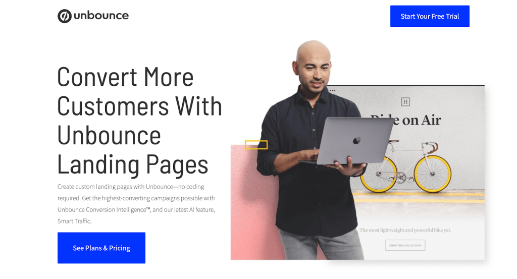
Their selling point is explained in BIG BOLD text right there – with the sub explaining how easy it is.
They also use an easy-to-see and access CTA in the top corner. And just below the fol, you come across testimonials (social proof) plus the benefits and features simply outlined and lots of white space.
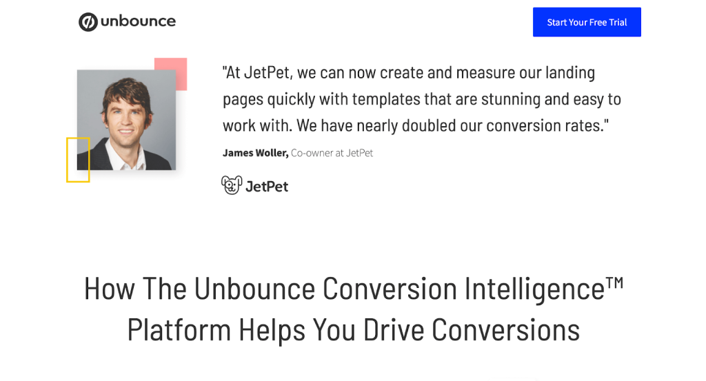
Although they only use one customer testimonial here, they could use a grid of three or four to really ramp up the social proof.
As far as the standard for high-converting landing pages goes, Unbounce is always going to offer a good point of reference.
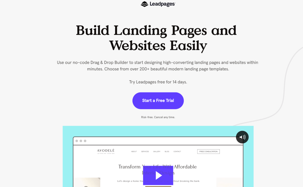
Leadpages
Staying with landing page software, we’re looking at Unbounce’s competitor Leadpages (because we can). And, of course, there are some more interesting uses of content and landing page layout that you can learn from.
Leadpages start with their clear statement about how their product works, with an animated gif helping to highlight the whole process. A great way to keep people engaged with the landing page and want to scroll down.
Below the fold, we start to see a sales pitch and the social proof (how much customers trust their product). But for me, I would prefer to see the product features a little sooner. These make an appearance a bit further down the page…
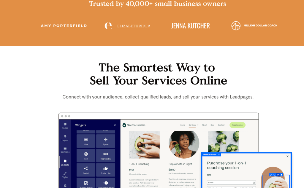
The benefits of using their product are stated clearly, including some reasonably detailed information expanding on the headlines.
The call to action is also used regularly along the entire length of the page, giving the potential customer multiple chances to convert.
The product features actually appear quite a long way down the page – which might have been a decision made to engage less technical marketers. Although for me, I’d want to be seeing the functionality much sooner.
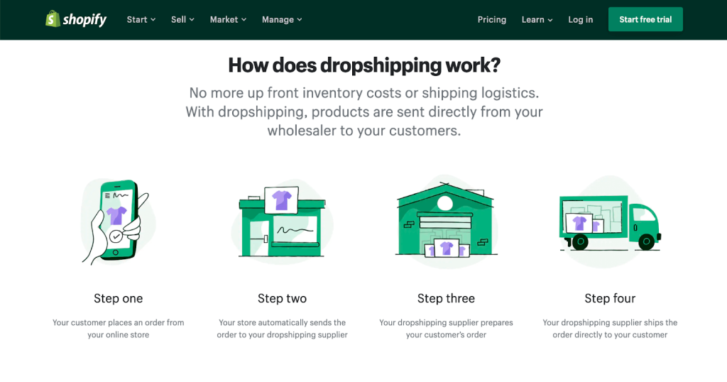
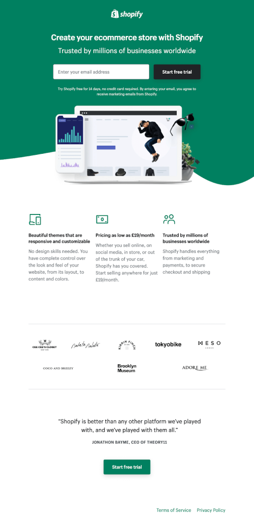
Shopify/Dropshipping
Another well known digitally focused brand, Shopify, has crammed lots of useful information into its landing page. In fact, what makes this stand out as a great landing page example is the fact that this reads like a simplified user guide to dropshipping.
The first thing the visitor sees is the signup for the free trial, which draws in those who have already made up their mind.
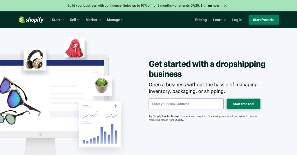
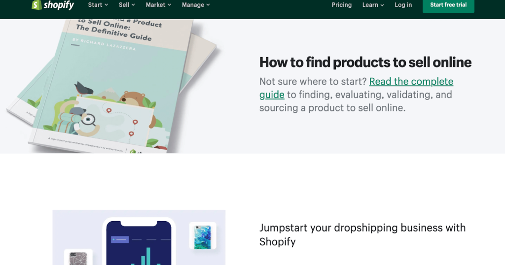
But scroll down… And we start to see how Shopify is winning over those who might be hesitant to get started, using the combination of a guide and a sales pitch…
They link to their free guide (lead magnet) to getting started with dropshipping.
And of course, they highlight the product details, features, and benefits throughout.
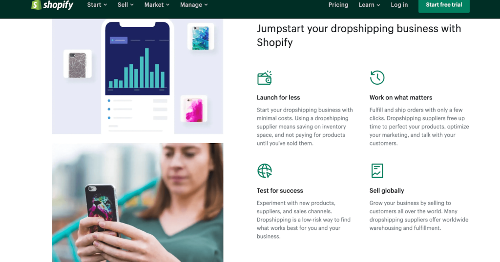
This is a really good example of including a lead magnet, to harvest those potential prospects who aren’t quite ready to buy yet. And with those email addresses, of course, you can start to use your email marketing funnel too.
Shopify/general page
Same company, different product and approach. This landing page is for setting up any e-commerce site (not just dropshipping).
Instantly, they’re selling the dream (literally) plus offering an incredible discount. Win/win, surely?
Big, bold text highlighting the offer gives the potential customer a good reason to scroll down and find out more. And the simple, bold white-on-black color scheme really makes the message pop out.
In fact, in contrast to the dropshipping landing pages, Shopify has gone very simple here. They also offer another e-commerce landing page here.
That’s it. That’s the landing page.
Sometimes simple is best.
Running an A/B test
When setting up a landing page, finding the most effective landing pages for your audience isn’t always going to happen instantly. This is where A/B testing, or split testing, comes in.
If you’re not already in the know, split testing or A/B testing is where you run two (or more) versions of your landing pages as part of the same campaign.
By doing this, you can work out which page gets the best engagement, lowest bounce rate, and highest number of conversions. In short, improving your landing page conversion rates is a case of trial and error.
The results of your landing page split tests can make a huge difference to future campaigns and help you create more effective landing pages.
There is a whole world of running split testing for landing pages – you can check out this guide from Hubspot.
Optimizing your traffic
In the world of paid ads, the issue of click fraud remains a constant thorn in the side of marketers and business owners.
Invalid traffic drains, on average, 14% of Google Ad budgets. This includes bots, competitors, and click farms – making protecting against click fraud a key part of the strategy for the average digital marketer.
Read more about click fraud in our guide.
Whatever campaign you’re running online, improving your traffic quality can help you improve conversion rates and save money.
If you’re running paid search or display ads on Google Ads, Bing Ads, or social media campaigns on Facebook Ads, run a traffic audit with ClickCease.